Field notes · Look · Try · Compare
Comparing color and black-and-white portraits
Compare color, tones and gestures while keeping each photograph's context.
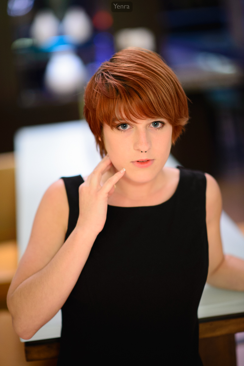
Woman with Red Hair Poses for Photo Shoot · Photograph: Yenra
Captured: 2013:06:14 23:18:00
Color and monochrome give you different information to explore. Color can connect hair, clothing and surroundings; a black-and-white rendering invites attention to their light and dark relationships. Comparing the two can help you decide what you want a photograph to communicate, without needing to declare one approach better.
Notice the contribution of color
Warm hair and skin colors stand out against the dark top. Blue, white and amber areas appear in the background. A hand rests beside the face, making another light shape above the dark clothing.
Begin by describing one color relationship. You might notice the warm hair beside the cooler background, or how the dark top leaves room for the face and hand to stand out. Then look at brightness: color and light-dark contrast can both contribute to the picture.
Ask what the colors help you recognize or connect. The answer can be modest: a patch of blue behind warm hair, or a color you want to echo elsewhere in a collection. Naming that contribution gives you something specific to consider when choosing a rendering.
Follow tones and gestures in monochrome
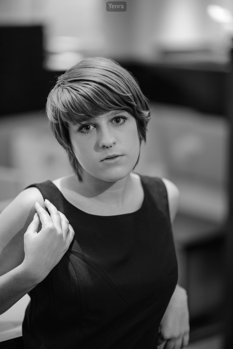
Woman in Sleeveless Dress · Photograph: Yenra
Captured: 2013:06:14 23:18:56
The existing monochrome portrait presents hair, skin, clothing and background through gray tones. Bright strands of hair sit beside a darker area; the face and hand separate from the dark top. The head is at a different angle, and the hand rests near the shoulder.
Notice those changes in gesture as you compare. A preference for this picture might involve the head angle, hand placement or framing as well as the monochrome rendering. Giving each difference a name helps you make a more useful comparison.
The source times are 23:18:00 and 23:18:56 on June 14, 2013. Both original files are shown complete and unchanged. Their appearance does not tell us which editing method was used or what the photographer intended, but it gives us visible relationships to study.
Keep three questions beside the pictures
| Question | Color example | Black and white |
|---|---|---|
| What color information is present? | Warm hair and skin; blue and amber background areas. | The existing rendering shows gray tones. |
| What stands out through light and dark? | Bright face and hand against dark clothing. | Bright face, hair and hand against dark clothing. |
| What else changes? | Hand beside the face; a more frontal head position. | Hand near the shoulder; a different head angle and framing. |
Try a comparison with one of your own photographs
Keep your original and make a separate monochrome working copy in an editor you already use. Retain the same crop and compare both versions at the same size. This gives you a way to explore rendering while keeping the subject, pose and framing consistent.
Write one thing color contributes and one light-dark relationship you notice in monochrome. You can choose the version that suits your purpose, keep both as alternatives, or return to the question later. A useful observation is a worthwhile result on its own.
If you compare different photographs, add a note about changes in pose, expression, background or framing. Keep source links, dates and confirmed credits with any examples you share. That small record helps your comparison stay thoughtful and makes the photographs easier to revisit.
Look back with curiosity.
- What becomes easier to notice?
- Which variation would you like to explore next?
- What small observation would you like to keep?
Keep exploring
Noticing light and dark shapes · Making a small color palette from a photograph · Choosing between similar portraits
Browse the complete Anime Mid-Atlantic 2013 gallery.