Field notes · Look · Try · Compare
Making a small color palette from a photograph
Keep a simple three-color note beside a photograph and discover another way to look.
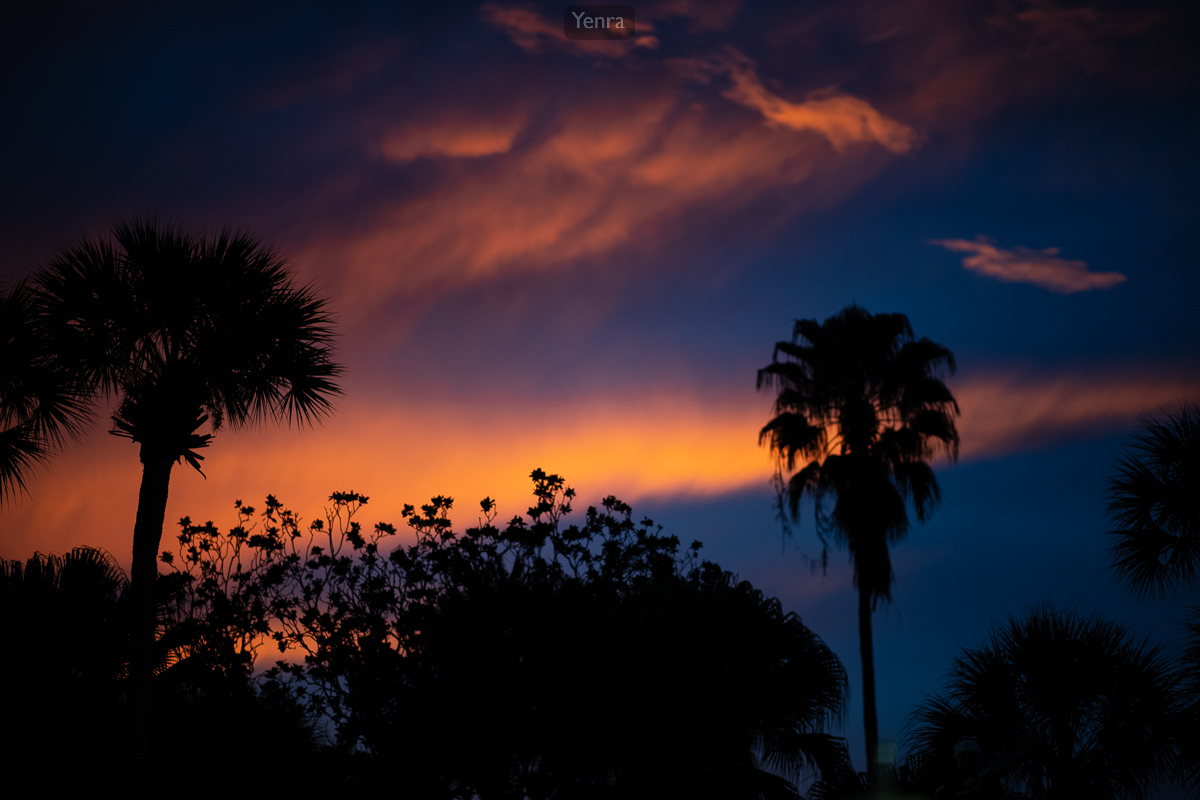
Sunset Silhouette · Photograph: Yenra
Captured: 2019:12:13 17:38:31
A small palette can become a visual note beside a photograph. Three colors are enough to remind you of a contrast, an accent or a group of related hues you would like to explore again.
The examples here select three values from each photograph’s existing recorded palette. The everyday color labels are new reading aids. Each selection offers one way to look, and you can make a different one that supports your own observation.
Choose three useful colors
Dark palm and shrub silhouettes sit against orange clouds, deep blue areas and quieter purple tones. Near-black, deep blue and orange make a compact note of one relationship within the complete picture.
Look back at the photograph after reading the palette. The three blocks simplify a much richer image. They can help you remember a relationship while the original photograph keeps all its transitions, details and variations.
Begin your own note with three plain color words. If you want to record values too, a familiar color picker or an existing recorded palette can provide a starting point. Words alone are useful when you simply want to remember what caught your eye.
Keep an accent and a neutral

Holiday Star Butterfly · Photograph: Yenra
Captured: 2019:12:14 13:04:49
The red outfit makes a large, recognizable area within the holiday portrait. Pale trim and warmer light tones offer quieter companions, with many other colors present in the wand, decorated tree and surrounding people.
This selection keeps red beside pale gray and warm beige. Compare how the red feels between those two tones, then look again at the photograph. Which parts of the whole image were left outside this small note?
A palette does not need to include everything to be useful. You might choose an accent you nearly missed, or exchange one neutral for a different color. Write one sentence about the relationship you want the selection to help you remember.
The supplied title and original archive link remain with the picture. The palette is a companion to that photograph, so a reader can always return to the complete image.
Explore a related group of colors

Poison Ivy Costume · Photograph: Yenra
Captured: 2019:12:14 17:49:17
Green clothing and leafy details share the frame with surrounding foliage. Pink flowers and pale purple tones provide smaller differences among the greens.
Two greens can be worth keeping in the same note. Their different brightnesses give you a relationship to compare, while the pale purple introduces another direction. A three-color palette can explore a related group as readily as a strong contrast.
The values shown here come directly from the stored palettes; the original eight-color records remain intact. The selected values are starting points for looking at these finished photographs, rather than measurements of a particular object or the original scene.
To make your own note, place three labeled swatches beside a link to your photograph. Keep the names readable outside the colored blocks, so the note also works when printed without background colors. Hex values are optional, but they can make a chosen digital color easy to record.
Finally, exchange one swatch and look back at the whole picture. Perhaps the new selection brings forward a detail you had overlooked. Keep the version that helps you describe your observation, or save both with a few words about what each reveals.
Look back with curiosity.
- Which relationship does your palette bring forward?
- What does a quieter color add?
- What changes when you exchange one swatch?
Keep exploring
Following color through photographs · Noticing related colors in a photograph
Browse the complete Holiday Matsuri 2019 gallery.