Field notes · Look · Try · Compare
Following color through photographs
Explore dominant colors, small accents, and echoes across the archive, then make a three-frame color study.
Color gives you another way into a photograph. You might notice a large area first—the blue of a dress or the green of a garden—then discover a small accent that holds the picture together. Follow those relationships through a few frames, and the archive becomes a place to practice looking.
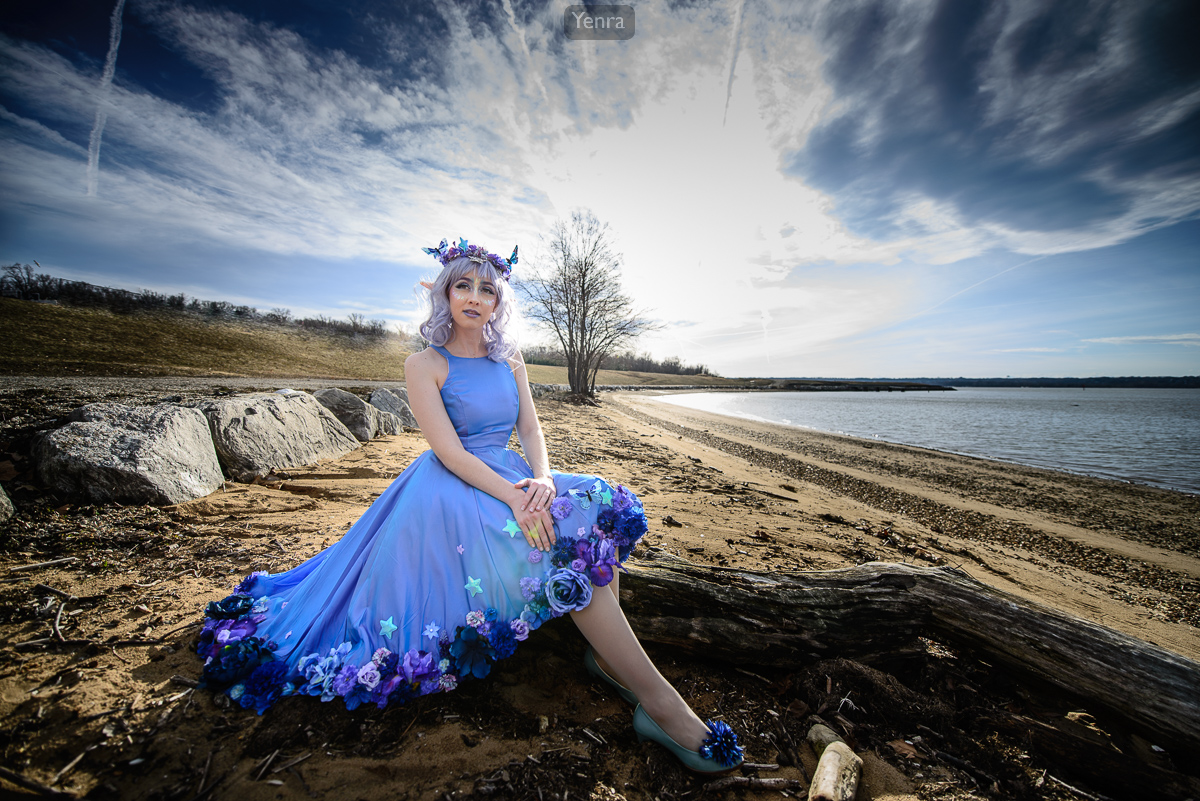
Blue Fairy · Photograph: Yenra · Credit: SunsetDragon
Begin with the largest color shape.
In Blue Fairy, the dress makes a broad blue shape across the foreground. Blue appears again in the sky, while the shore supplies warmer browns. Notice the different sizes of those areas: the dress, the sky, and the small blue details do not need equal space to feel connected.
Try looking at a photograph from a little farther away. Which color areas remain easy to recognize? Then come closer and look for small details that echo them. This shift between the whole frame and its details can help you decide what to include when making your own picture.
Compare a concentrated color with a scattered one.
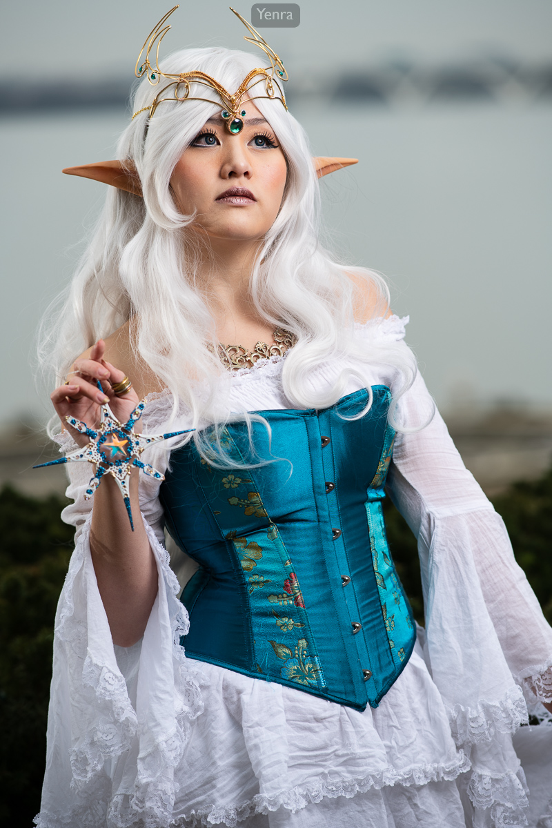
Winter Elf · Photograph: Yenra
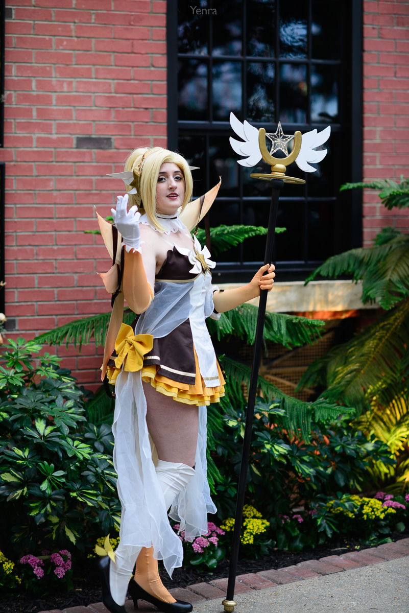
Magical Girl Mercy, Overwatch · Photograph: Yenra · Credit: Nickychu
In the white-haired portrait, the turquoise garment forms a concentrated area surrounded by pale fabric and hair. Small blue-green details in the headpiece and ornament echo that color. Follow those points and see how they draw your eye through the portrait.
In the portrait with a winged staff, yellow appears in the hair, costume trim, and bow. Green plants spread around the figure, while the brick wall supplies a red background. Look at how the costume’s repeated accents stay recognizable among several other colors.
Find the small accent.
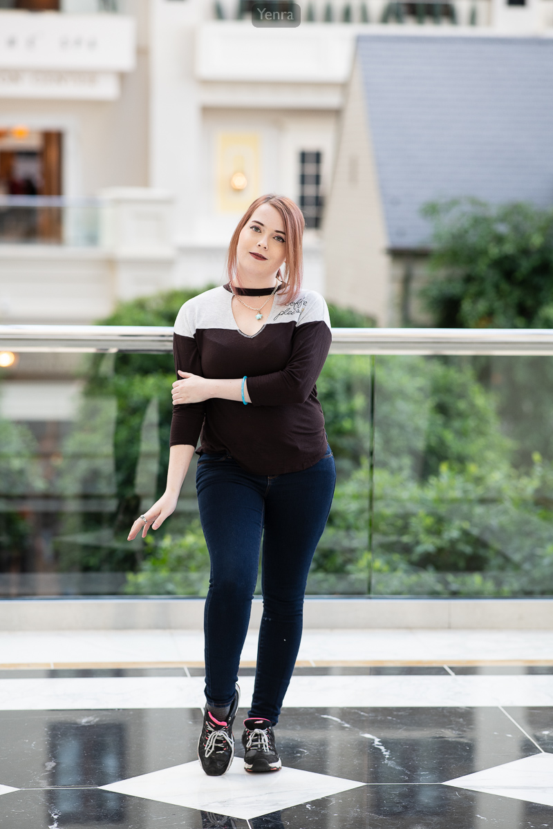
Fashion Sunday · Photograph: Yenra
The atrium portrait brings together dark clothing, blue jeans, pale architecture, and green foliage. A small blue bracelet is another place to look. An accent can be interesting precisely because it occupies so little of the frame.
Ask yourself where you first noticed the color and whether another part of the image repeats it. Then try following a different hue through the same photograph. There can be several useful ways to read one frame.
Use the color archive as a path of discovery.
These four photographs appear in the Cadet Blue collection. Each photograph has a recorded palette with several named colors, so the connection may be a small area rather than the most prominent color. Opening a photograph’s palette gives you more paths to follow through other events and sessions.
Let a color name start your exploration, then look at the whole image. Notice neighboring colors, differences in brightness, and how much space each area occupies. Those relationships are the material for your own color studies.
Try a three-frame color study.
- Choose a color you enjoy. It could be part of a costume, a wall, a flower, or an everyday object.
- Give it room in the first frame. Compose so that it occupies a substantial area. Look for a background that helps you see its shape.
- Make it a small accent in the second. Change your position or framing to include more of the surroundings. Notice where the accent sits.
- Find an echo for the third. Include another object or background detail with a related color. Try moving until the two areas form a relationship you like.
- Compare the three photographs together. Keep your favorite and note which choice made the color work for you.
Take three questions into the next scene.
- Which color occupies the most space, and which catches my eye first?
- Does a small accent have an echo elsewhere in the frame?
- What changes if I include a little more—or a little less—of the surroundings?
Explore all 1,233 photographs in the Cadet Blue collection, choose a different route from the color index, or try choosing a background with color in mind. Each experiment adds another possibility to your photographic vocabulary.